


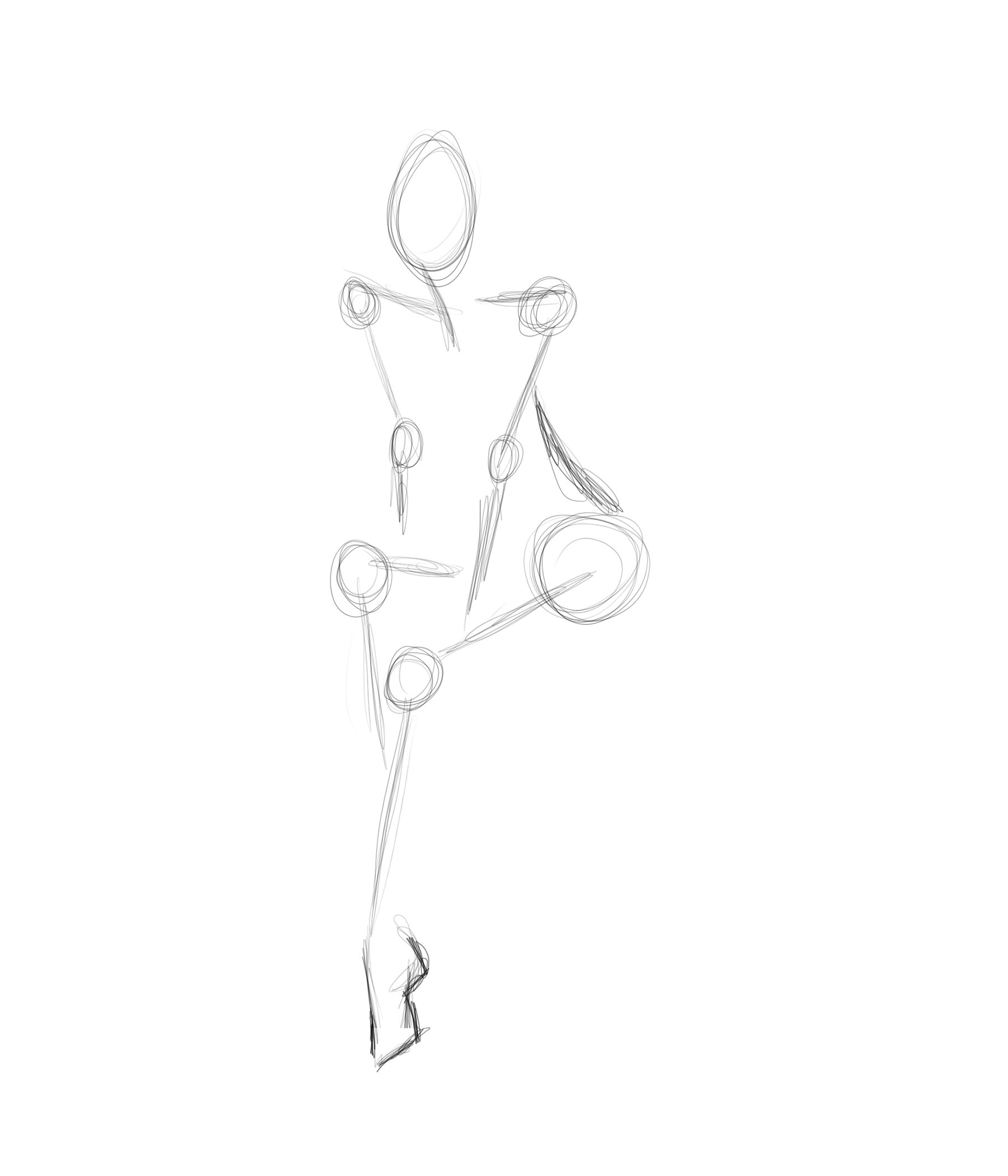
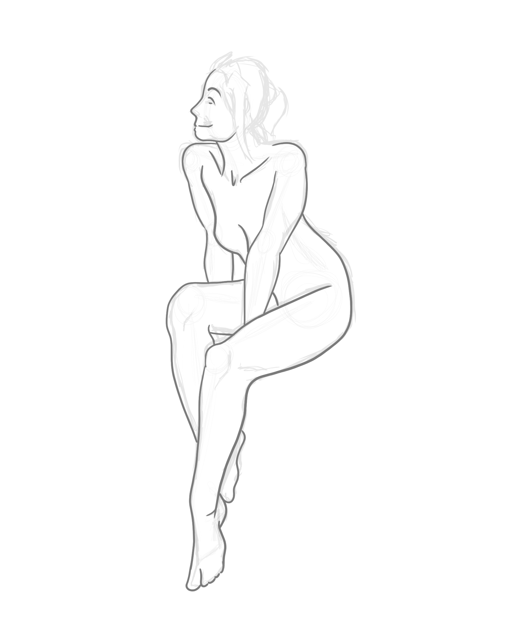
Frame
I like to start out by establishing a frame. I can roughly estimate proportions as well as pose with this. It’s easy to draw lines and circles. So I start there to build around.
Shaping
Next I will rough out some lines until I find a sensible outline. It doesn’t need to be accurate, it just needs to establish an idea of a reasonable body-mass.
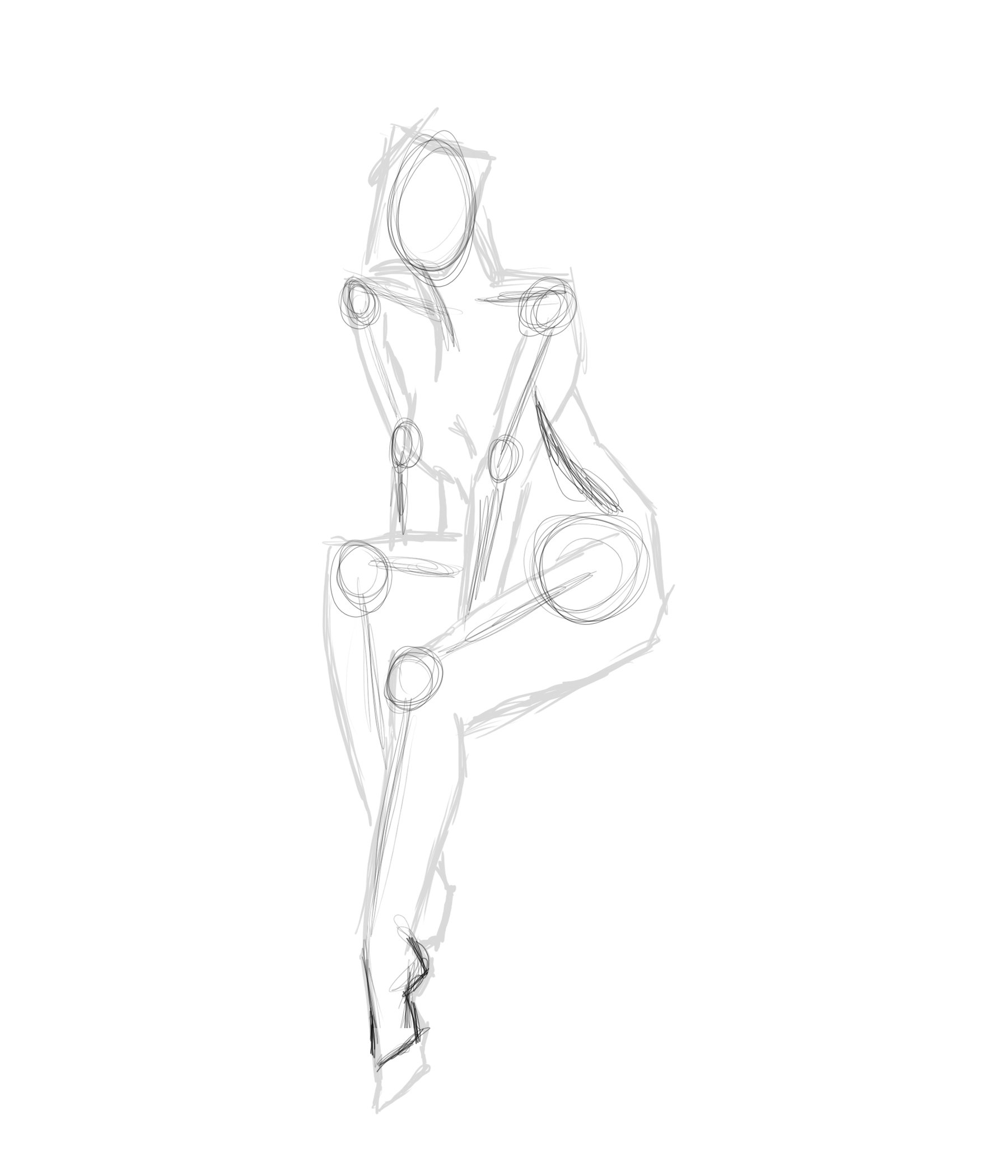
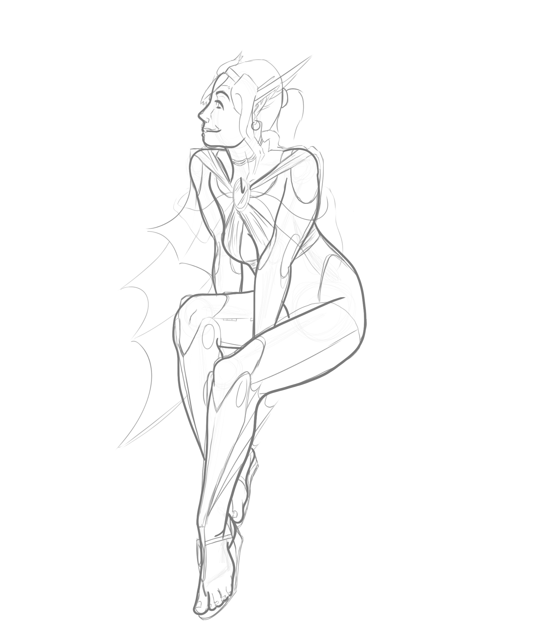
Refined Shaping
Moving into the rough elements, I like to begin incorporating more definitive features. This could involve hair, facial features, protruding bones, or other topographical elements.
Line Weighting
Once I have a rough character sketch, I begin the contouring process to fined the fine, pin-pointed outlines of a character. This is where the definition begins to present itself.
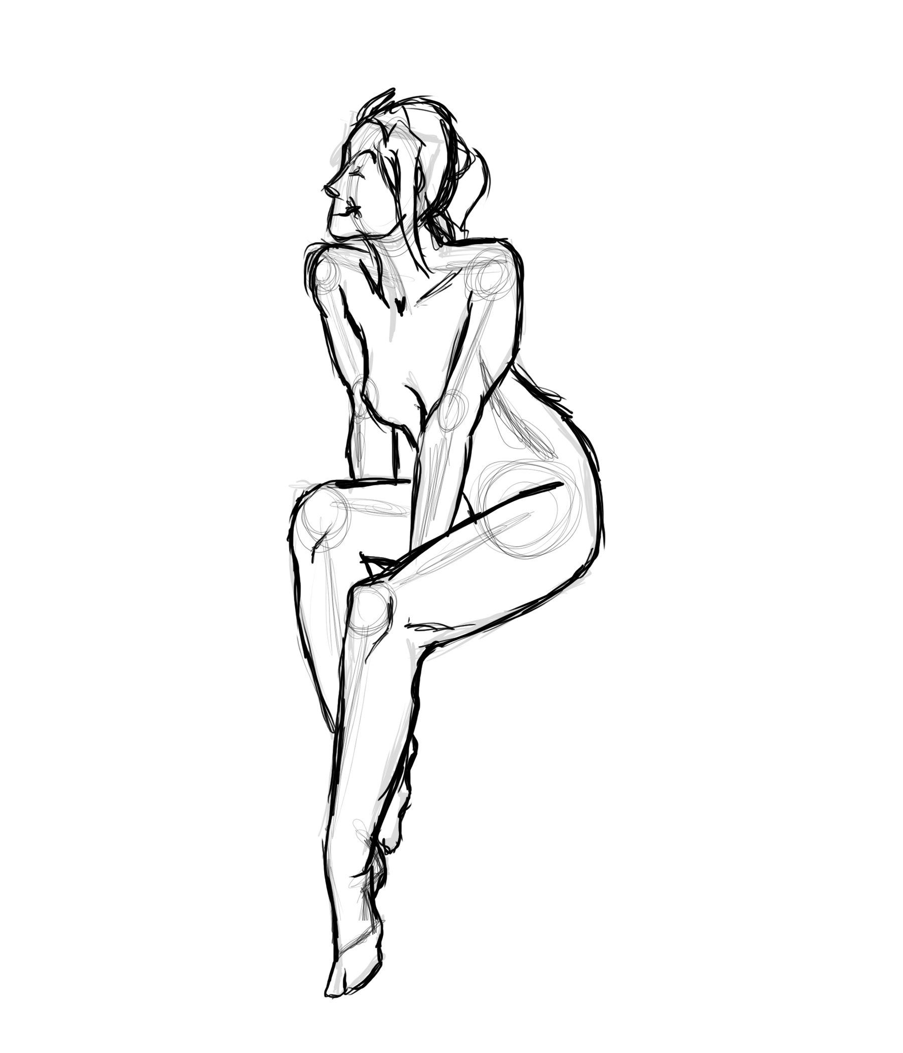
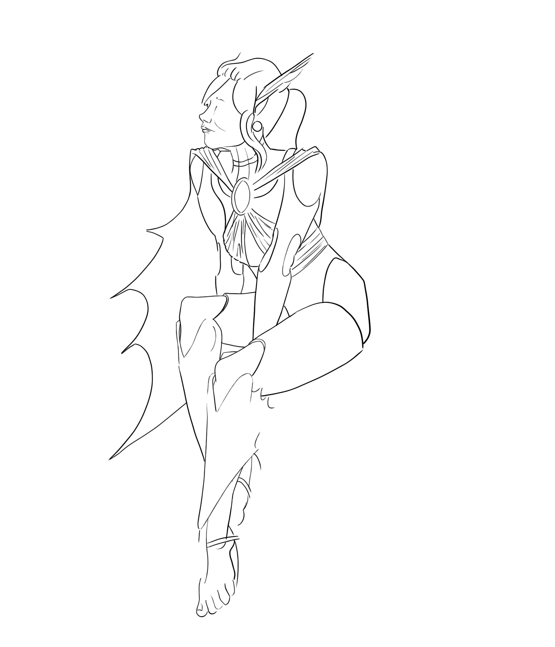
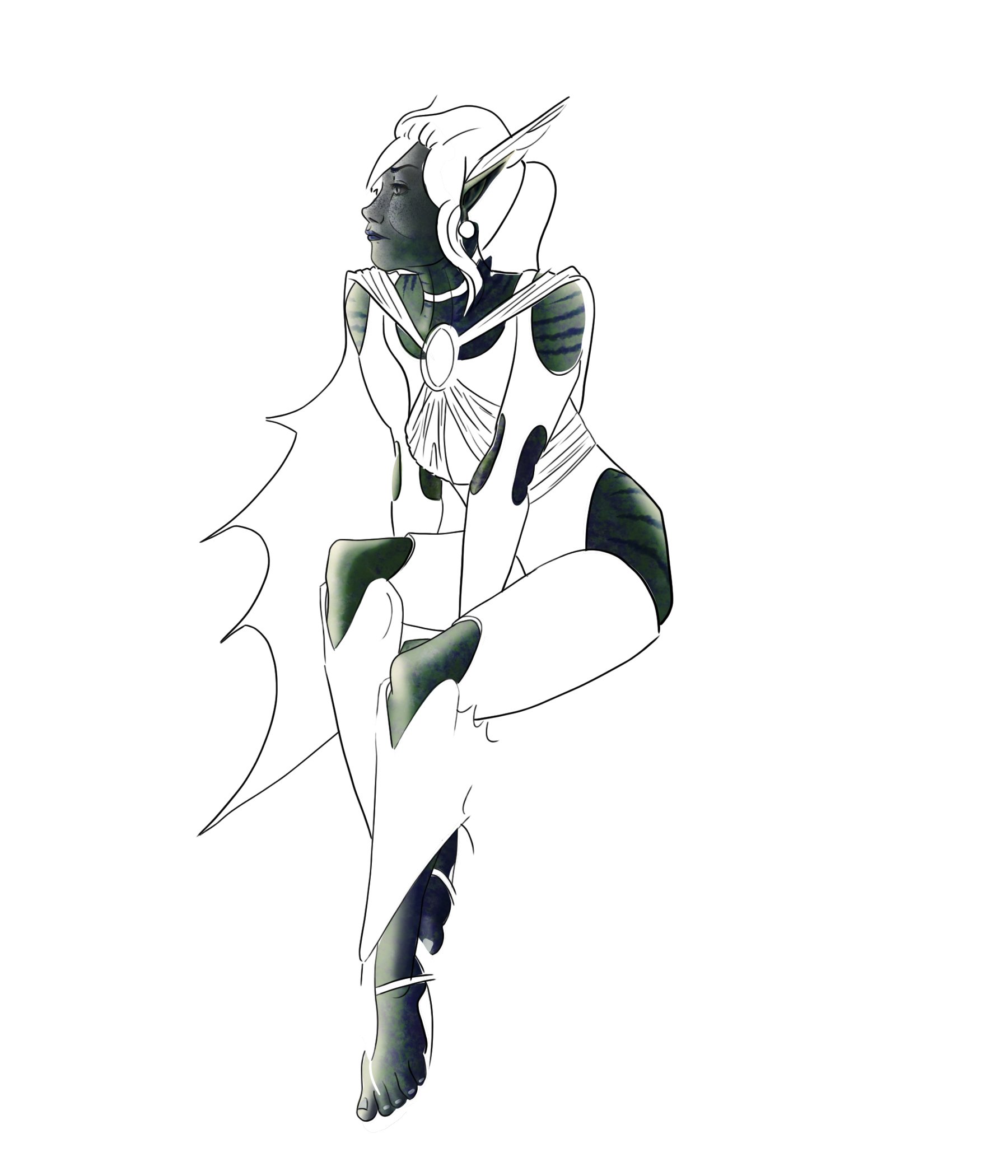
Clarifying contour
Once I get rid of the underlying sketch, I can begin to establish who this character is starting to become. I can get a better sense of body-masses, what details should round out and support this character this character, and what additive features belong in the scene.
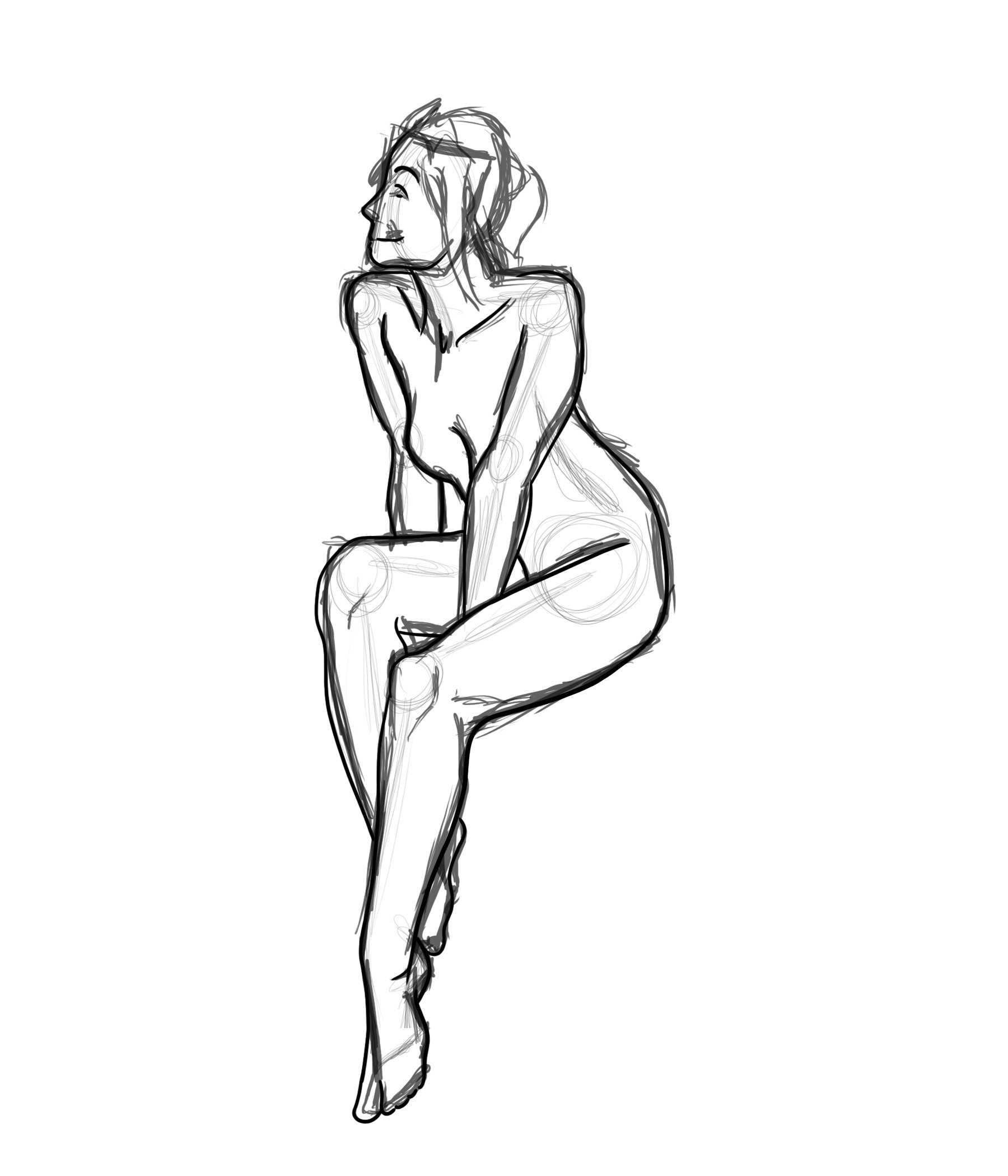
Penciling
When I have a proper contour, I like to begin adding and otherwise play around with the supportive detailing elements. This can help bring out some personality to a character.
Inking
With the last round of sketches, it really helps to add the same level of contours to the basic shapes to better define cohesiveness.
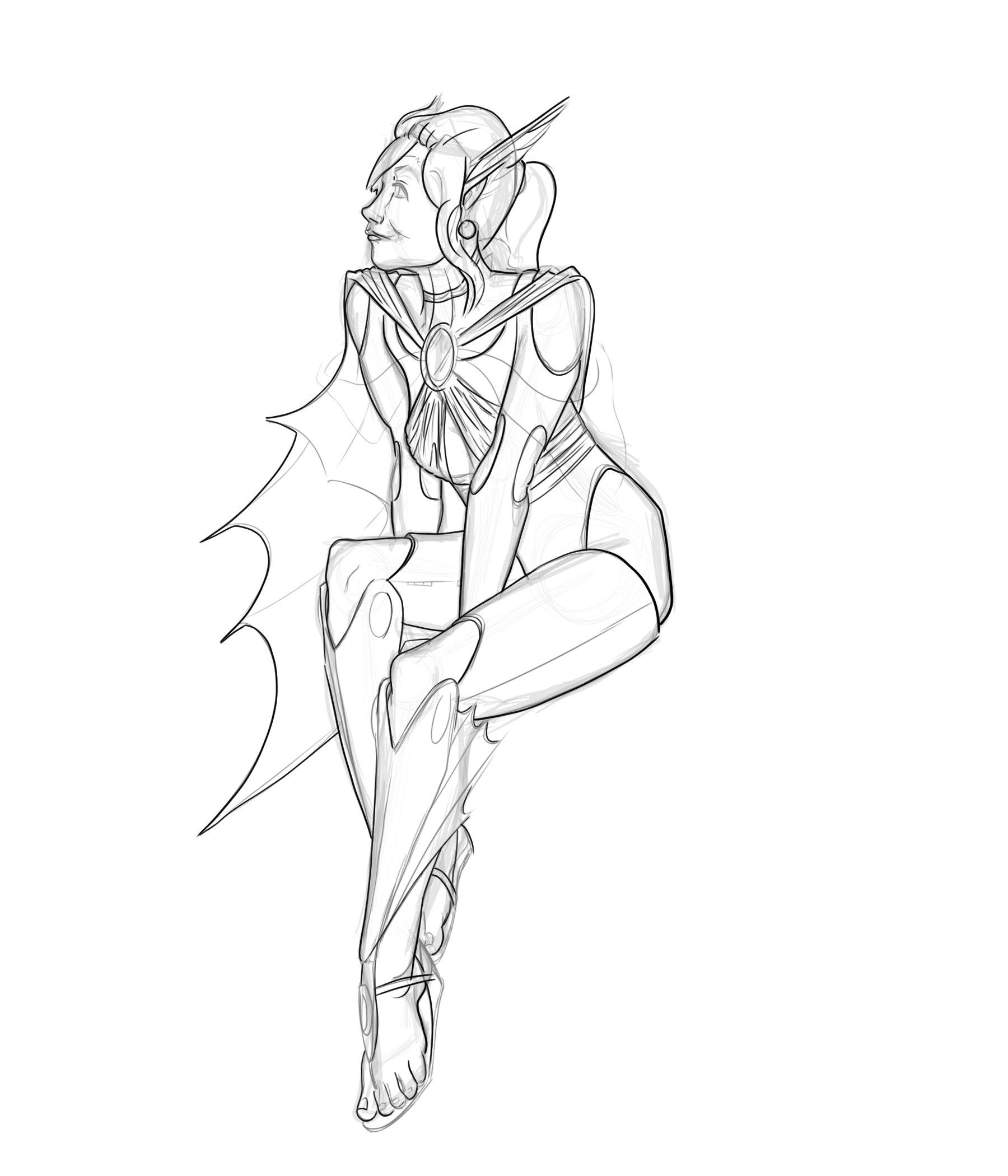
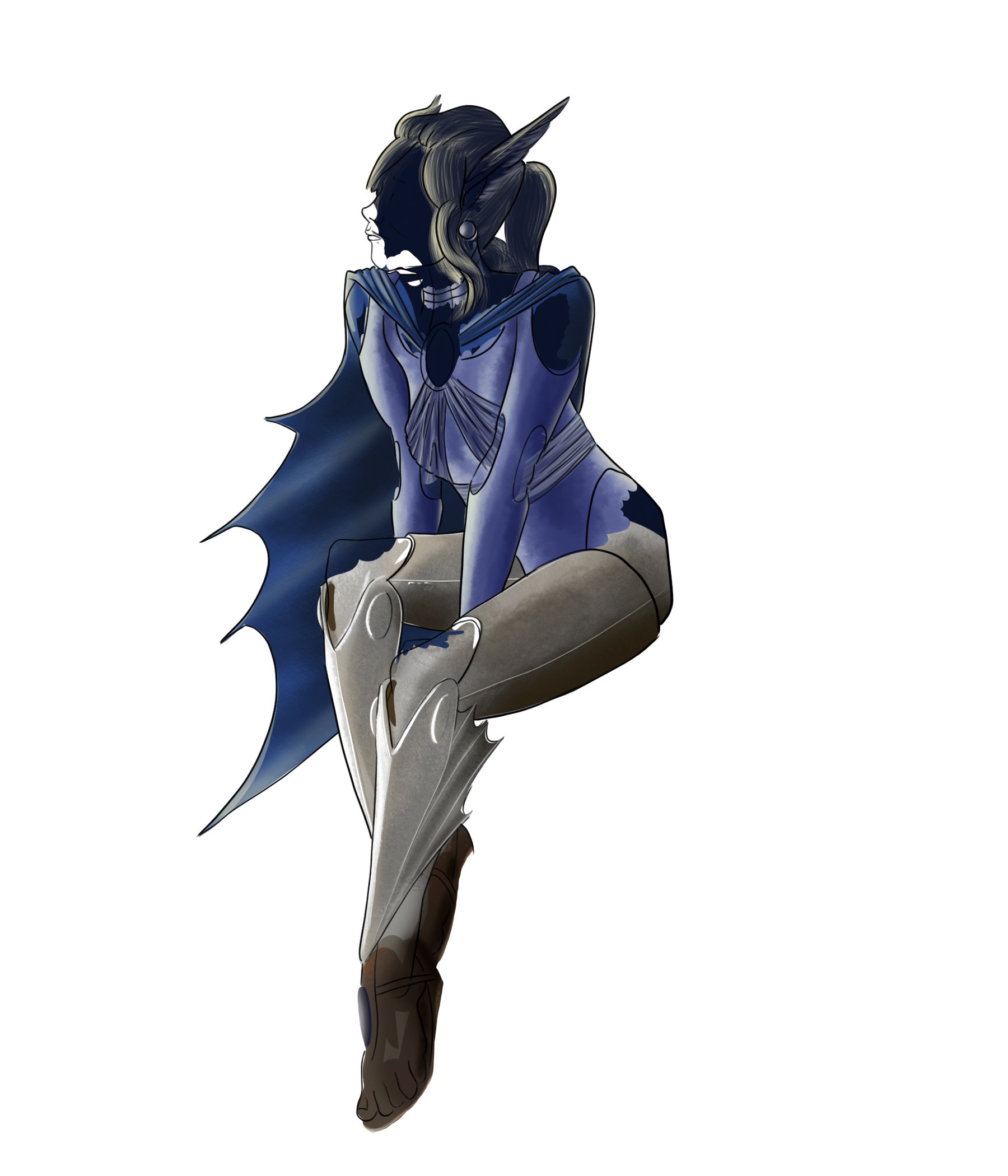
Layering
I like to double back by layering the Dark over the light contours, this way I can observe the mixing of hard contrasting shapes to soft detailing lines.
Layering color
I like to layer in my color features so I can focus on individual elements to a character. This allows me to work freely of concern or distraction of non-related elements.
Layering color pt. 2
Just as with the previous stage, I layer on remaining elements one at a time. This allows me to focus on working from proximity, or by color to establish working contrasts.
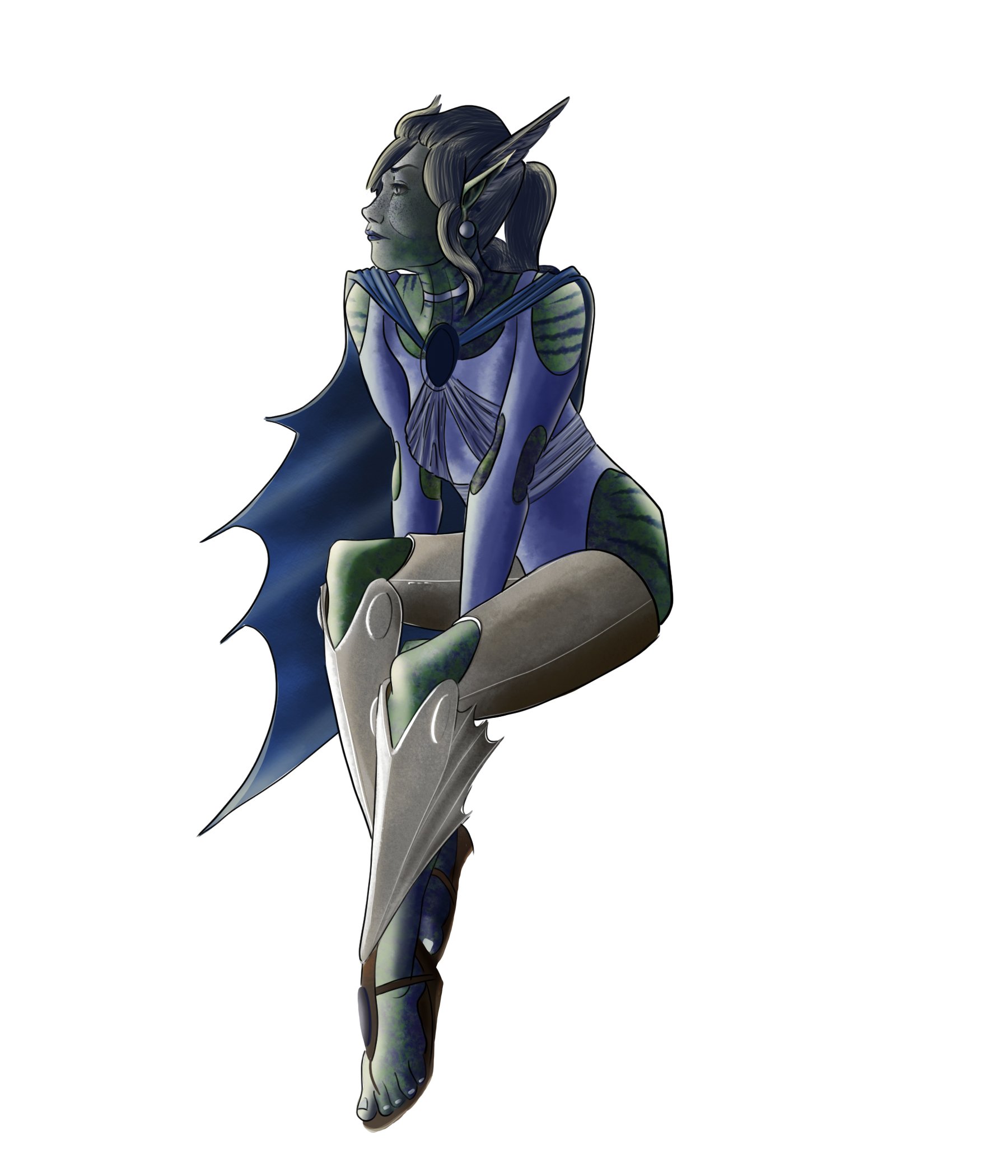
Fitting it all together
Layering everything together helps ensure that it not only fits appropriately but that it all works together as well. At this stage, it’s important to ensure everything builds contrast together. This way you can see the image piece by piece.
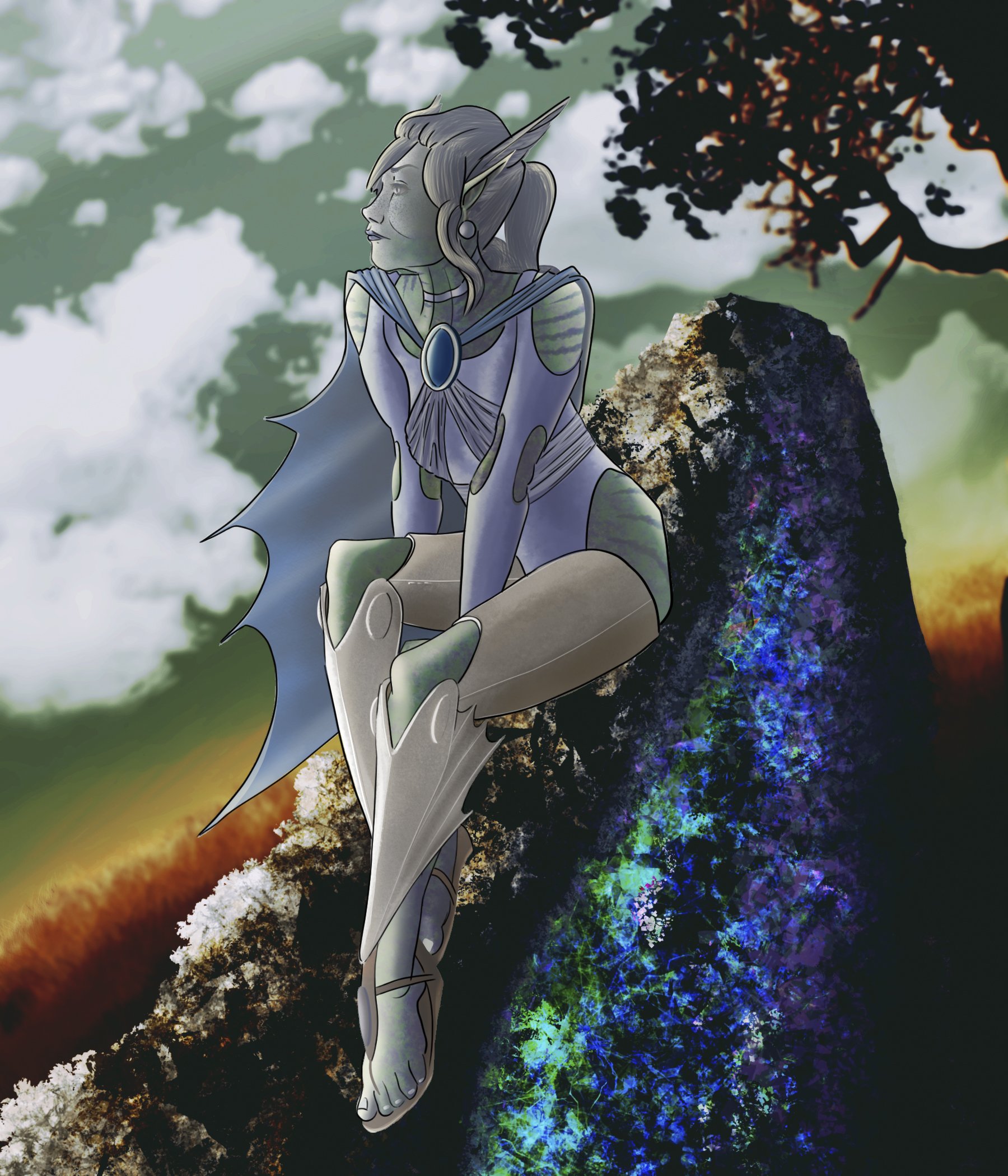
Building a background
Last thing is building a background. A good background will either complement or contrast with the character for emphasis.

Initial design sketches
Let’s start by roughing out a few character sketches

Initial design sketches Pt. 2
Lets explore a few more poses and rough ideas.

Initial design sketches Pt. 3
Lets try some poses without imposing shapes to the pose.

Who is he?
Let’s start off by thinking through this character. Let’s try ‘Caliban’ a classical villainous name, but with some modern twists. Let’s also run with a meta-theme about the natures of entertainment. Carnivals of chaos that attract an audience only to destroy them by the end.

What is he made of?
Since we already have a drawing that goes to the description, lets establish some visual themes to our character. We can start by exploring some colors and textures to the fabrics.

What else can we throw on him?
Sure, Caliban may be a half-demon prince running a hellish halftime show, but lets reinforce this with some mystical and creepy tattoos.

Finalizing a design
Here we have a final contour of our proposed character. He has form, name, and story. Now we have all the framework to define a character in a world. All that’s left is to flesh out our monster.

What kind of painting is this going to be?
We kickstart off our machination by making a decision to paint our antagonist a textured painterly style, or a smooth contrasted linear style. Lets explore each by focussing on the extremes of each as much as we can without losing the image. Seeing the differences to each, let’s borrow elements from both, and move forward with hard edges and tactile textures.

What about other angles?
The best way to ensure a character is fully developed is to view them at every angle you can. This way you can establish any and all necessary detail, leaving nothing to improvisation for any pose.

The full character
Now that we have a character, a name, and a story, we need to show him in a proper setting that also fits the character and his story.

Where is he walking?
We illustrate Saliban walking down stairs, so the sensible thing would be to paint some stairs.

Where is this?
We need to establish the background. If this is a modern twist on a classic villain, then we need to set this somewhere plausibly modern. Lets establish some more artificial colors like a muted blue-green.

What kind of space is this in?
Let’s establish that this is a wall, likely concrete. We can also add some chains and splatters to emphasize the dark nature of this production.

What next?
Let’s add some curtains to reinforce that this is a stage for a theatre. The folds in fabric really help shape the curtain.

Where is the lighting?
We can add shadows to the stairs from angles drawn from each of the firey light sources. This off-side lighting can reinforce the heavy shadow that plagues our villain.
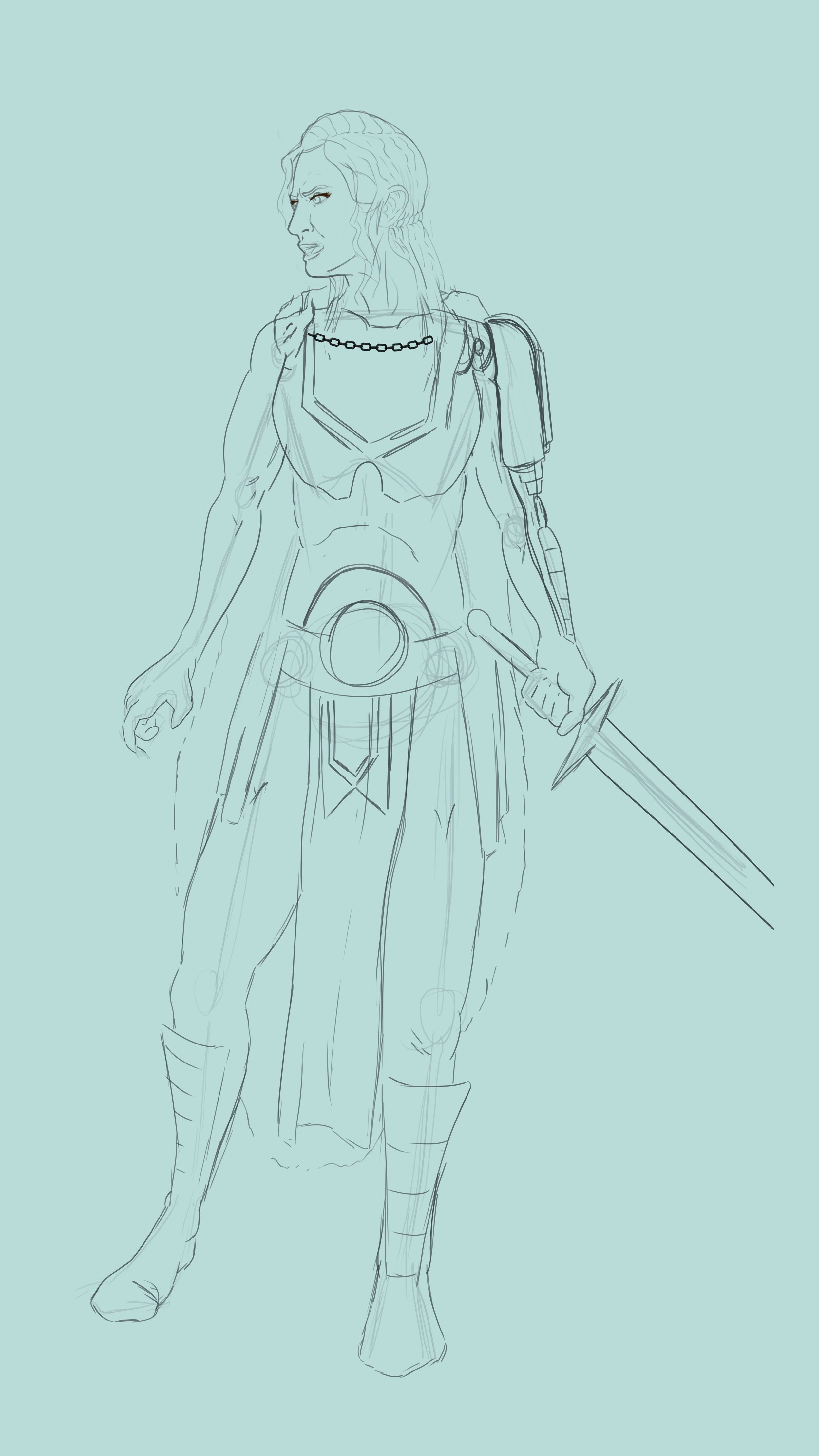
The Frame
First I start off with the final draft sketch. Let’s start off with the basic expectations of iron-clad. Armor, and sword. A necessity for any battle-hardened hero.
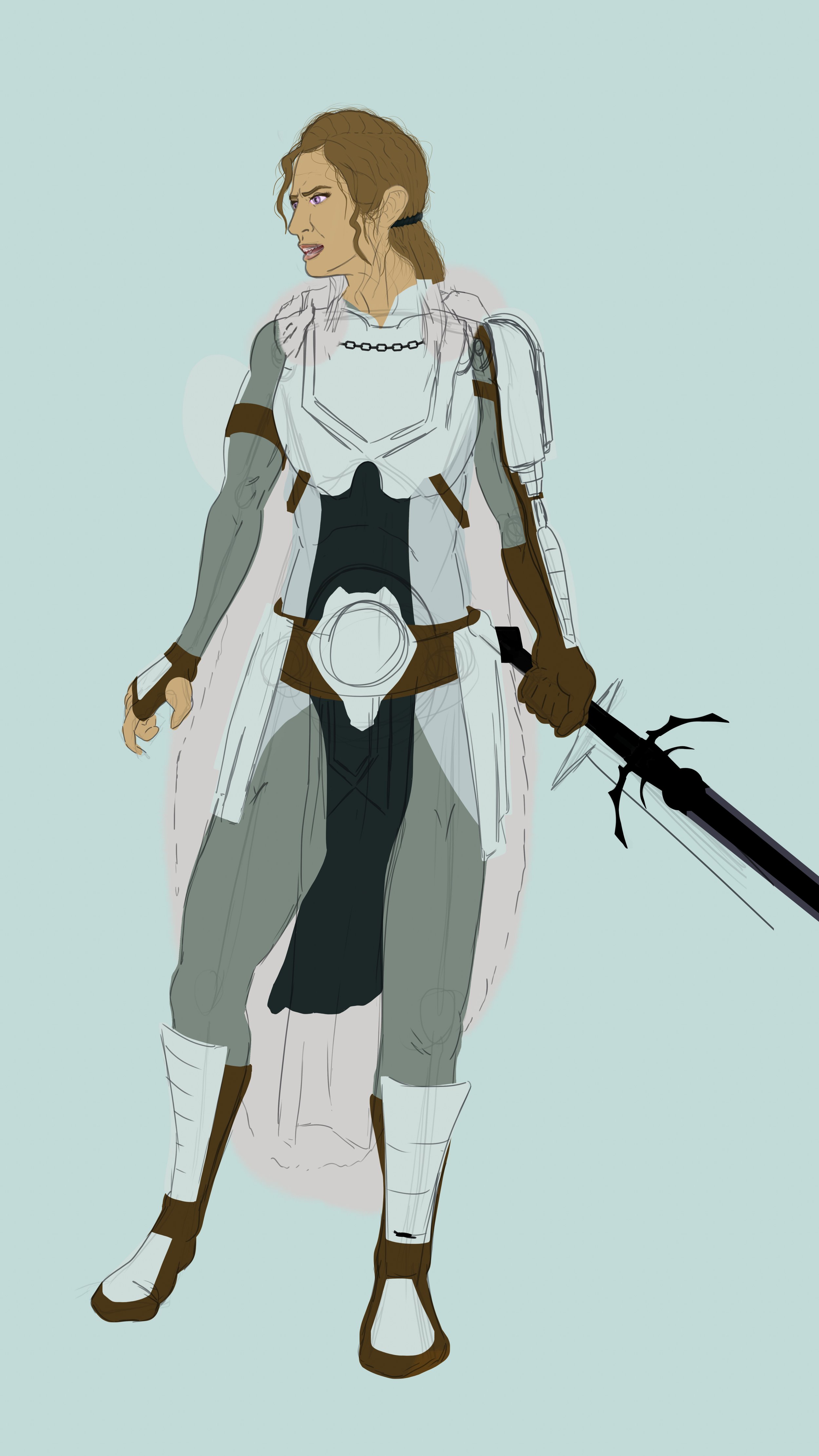
Color Shaping
Next step is building the colored shapes that fill the interior lines. Orange and blue build complementary contrast, value can lead us further into lighter blues against darker browns and oranges.
Shape Refinement
Moving forward I clean loose tags, and refine any rough shape edges. This is starting to look like a true warrior!
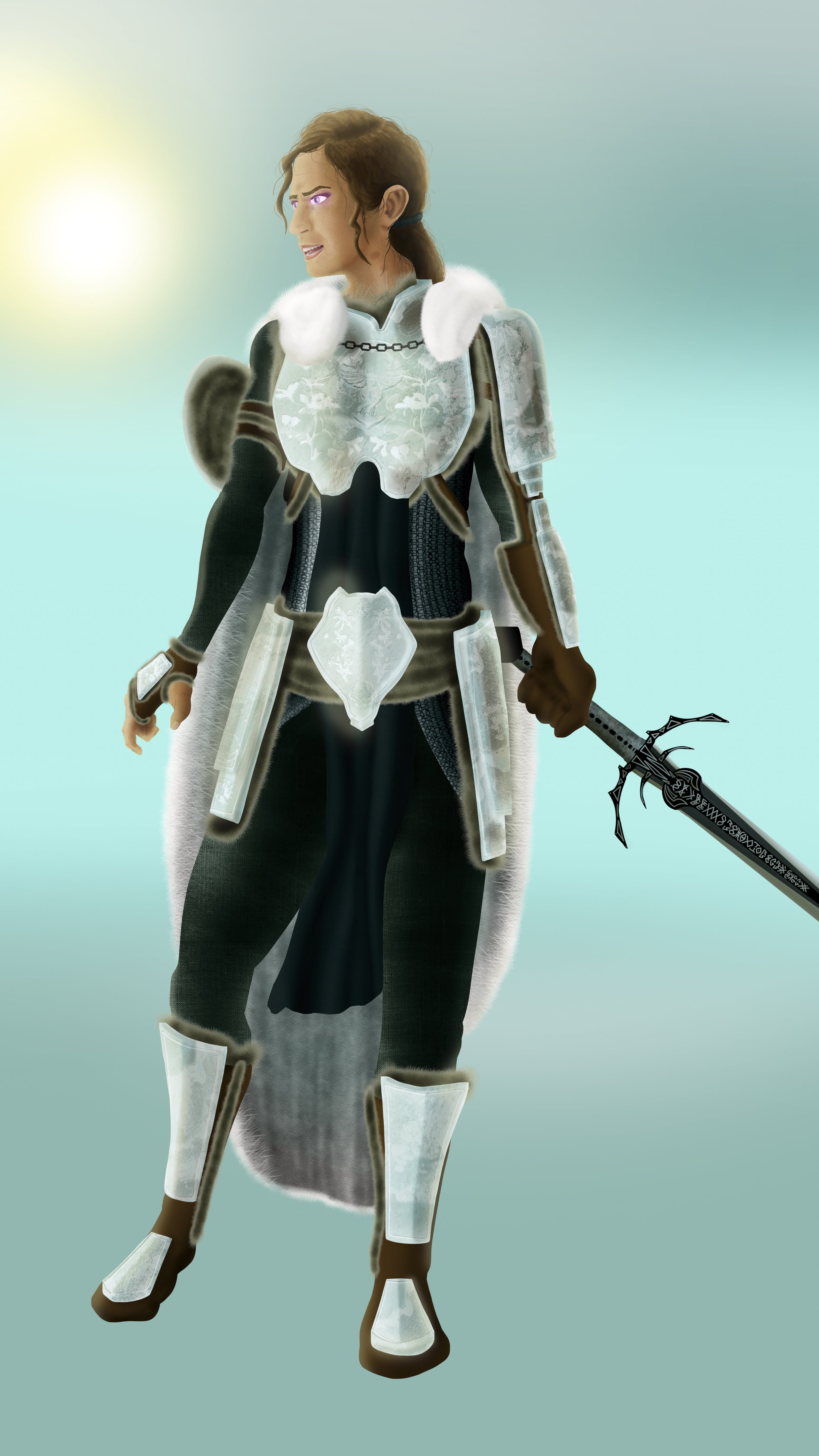
Initial Shading
To bring into the more 3D realm, I incorporate under-painted shadows. She has to exist somewhere. Why not somewhere with a nice medium array of light behind her, at an angle. This can show our troubled hero amid troubling darkness within her, yet awash with the light around her.
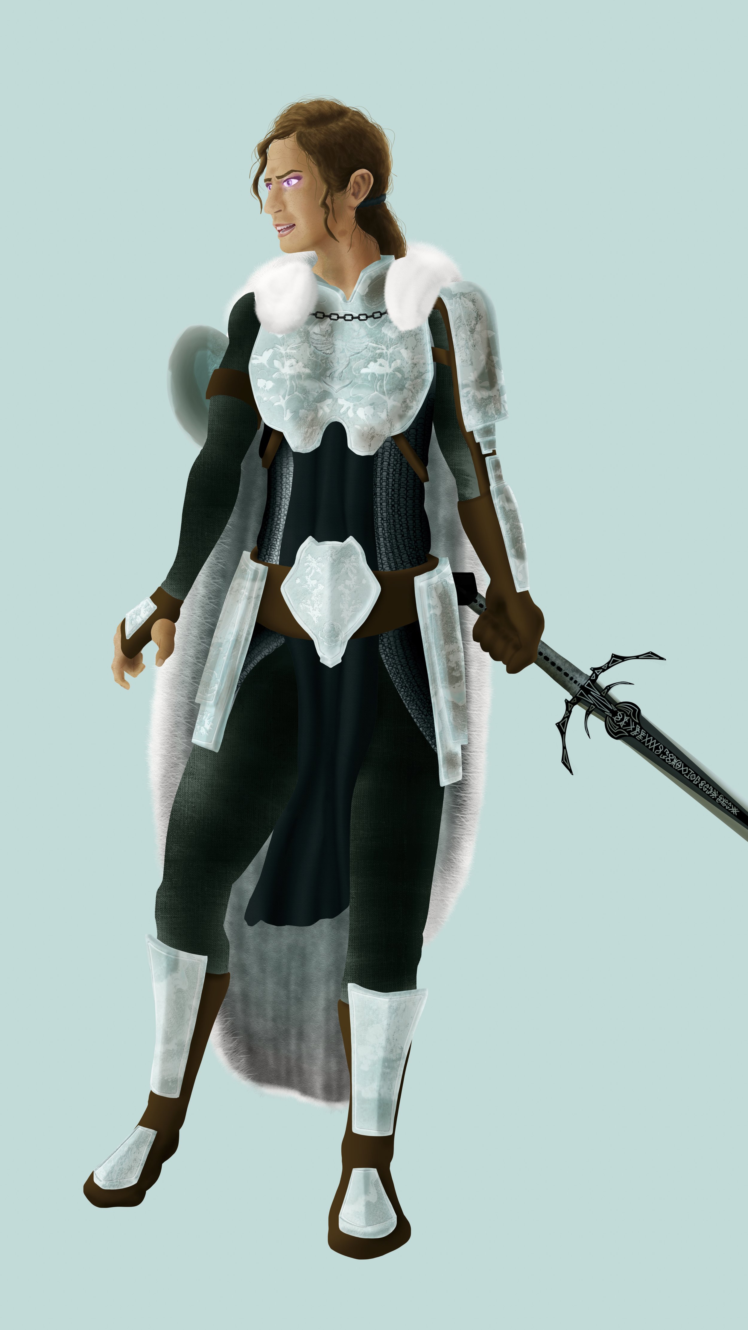
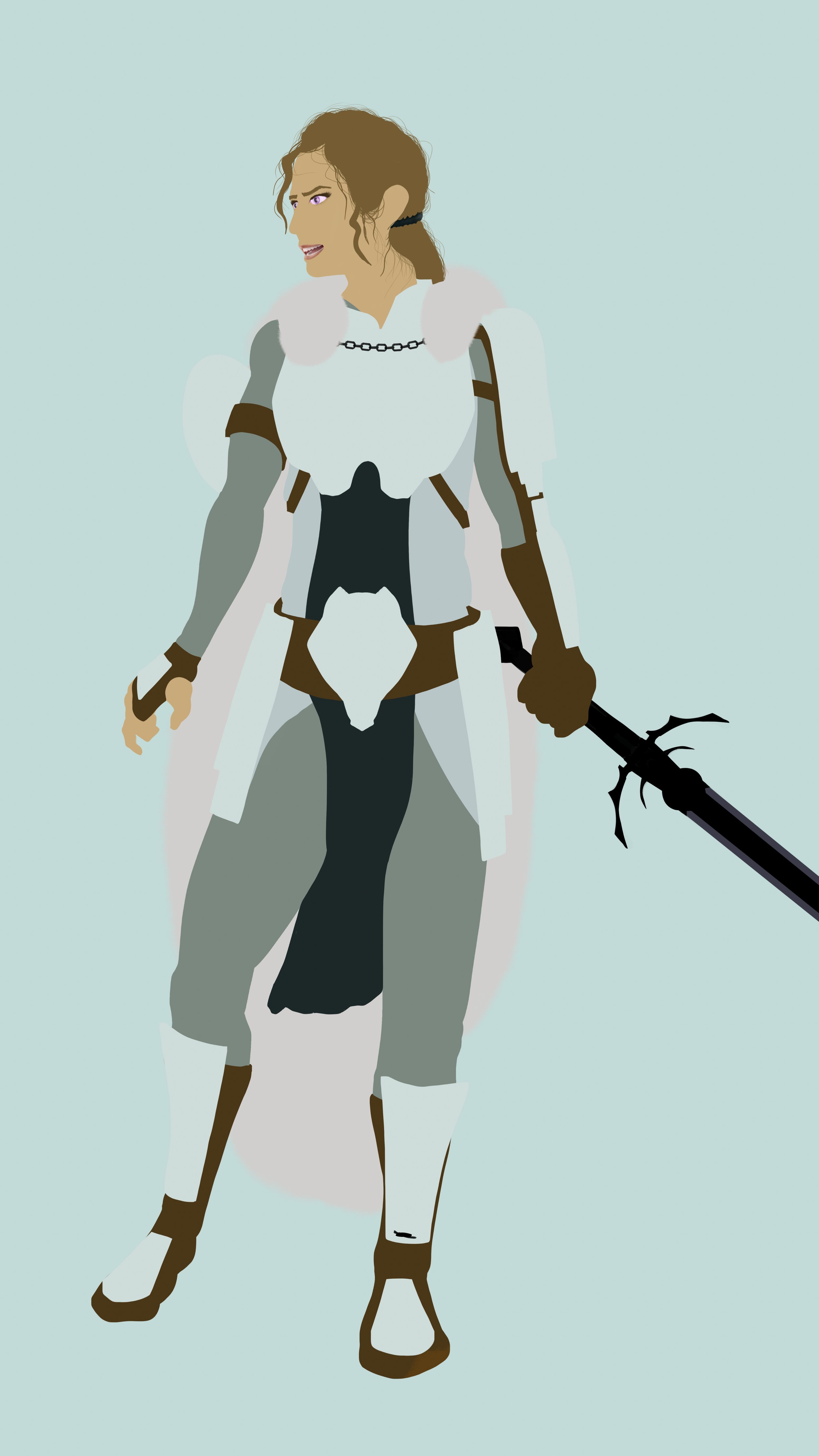
Accenting Textures
I add in detail and textures to main focal elements. Her armor in particular carry the rings of a chainmail underneath an ornate armor. This person is important. She can afford beautiful armor and weaponry. Her style is just as sharp as her blade. We can also dab in some magenta glow to her eyes for an air of mysticism
Accessorize
Next, I add in other supportive elements, and accessories to fill empty spaces. She wears a fur cloak. It would only make sense for her to line her clothes and armor in furs as well.
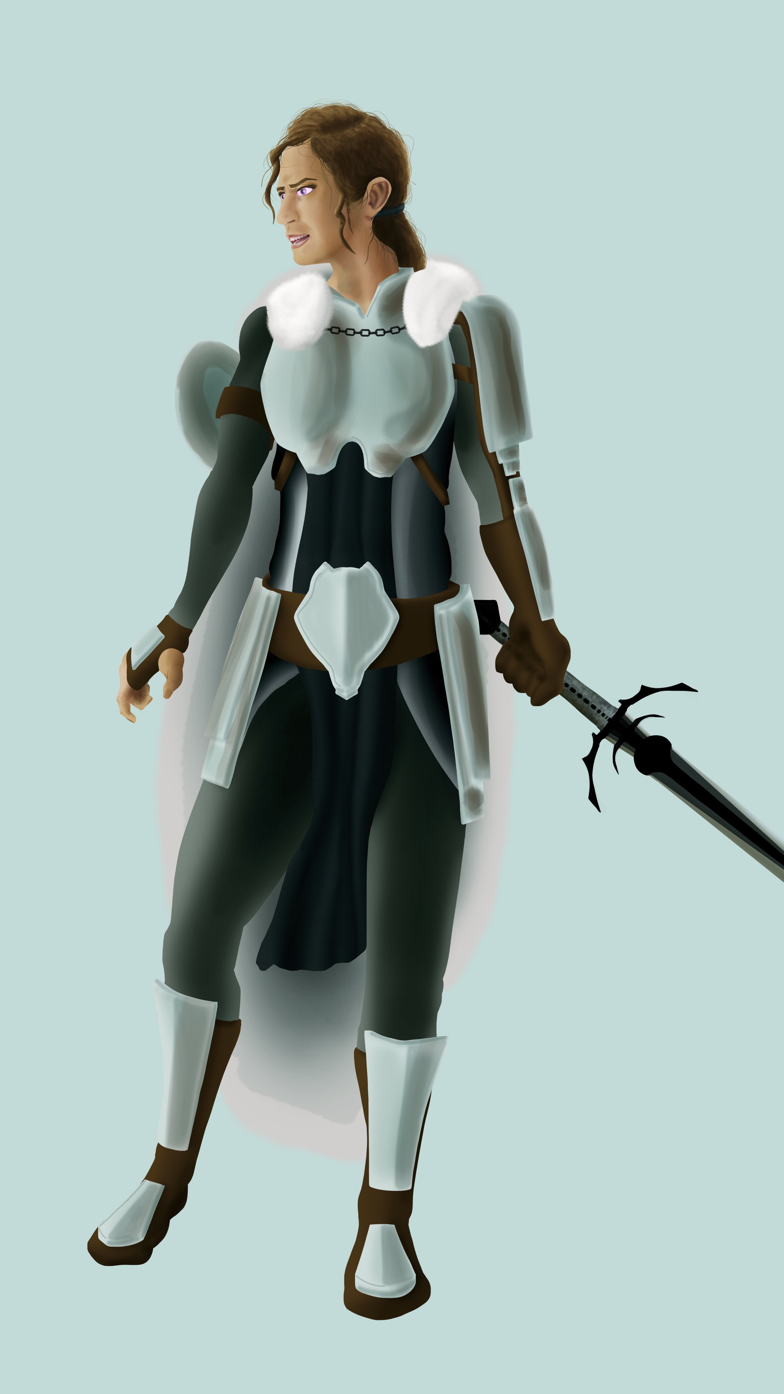
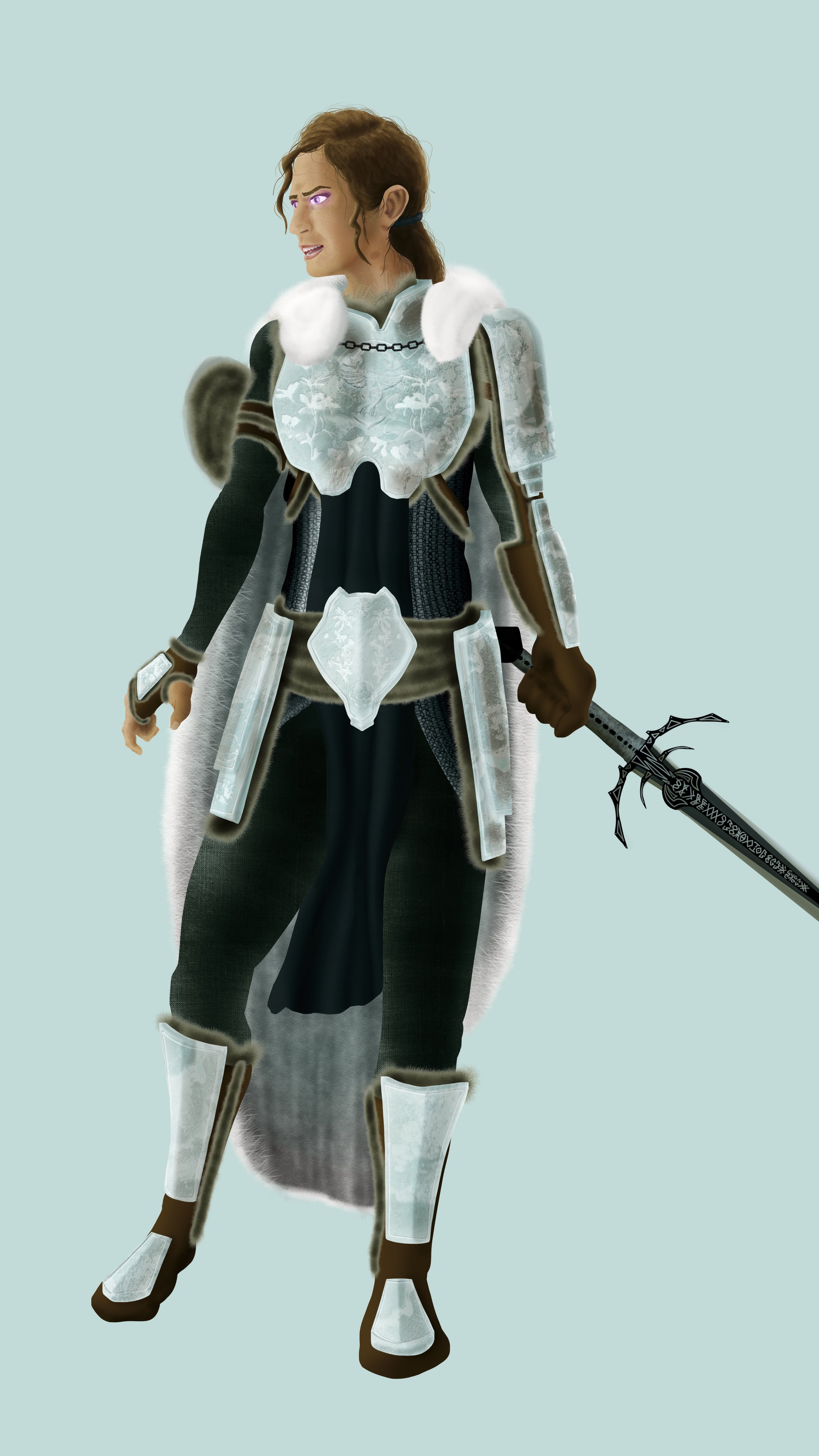
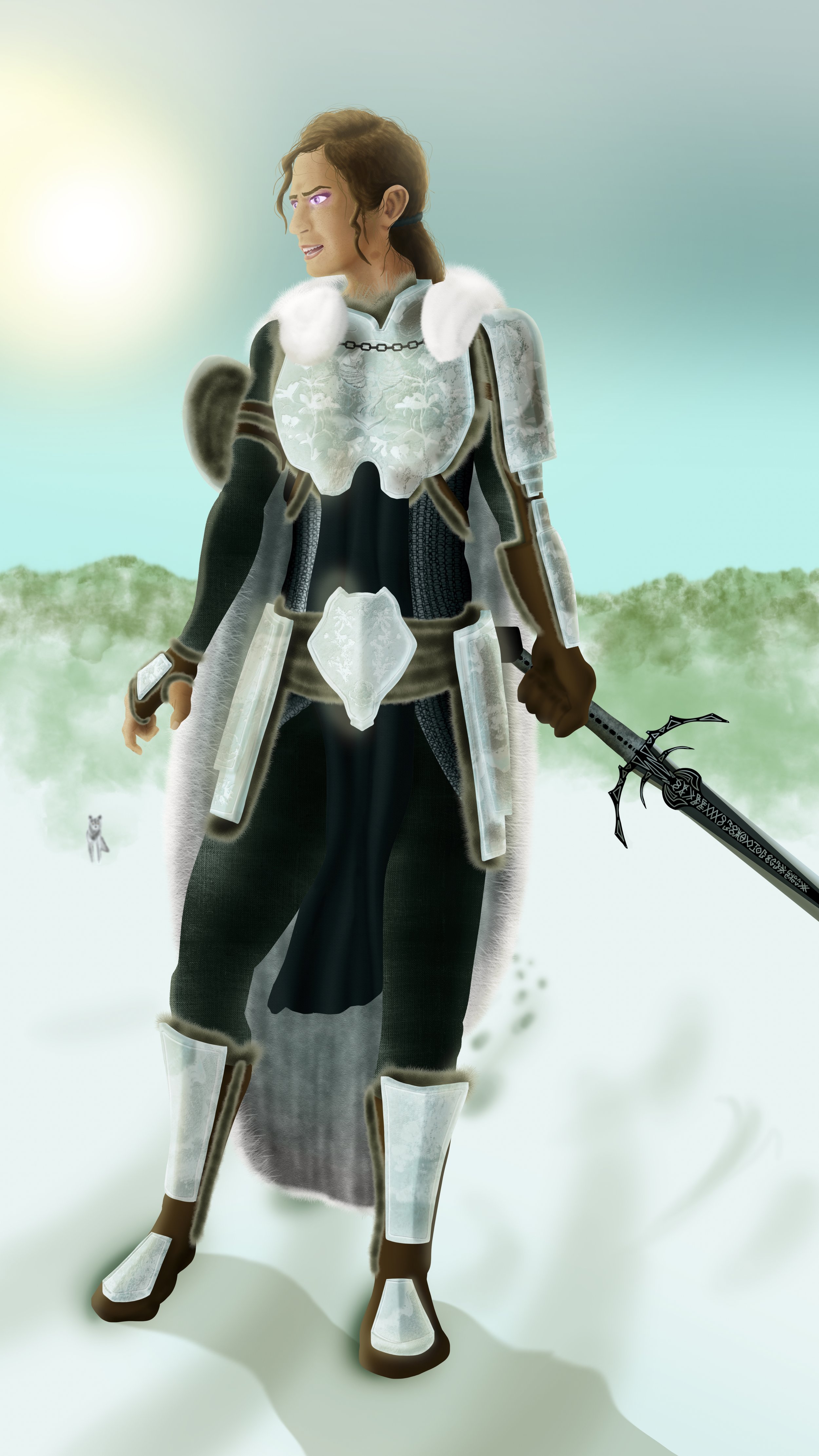
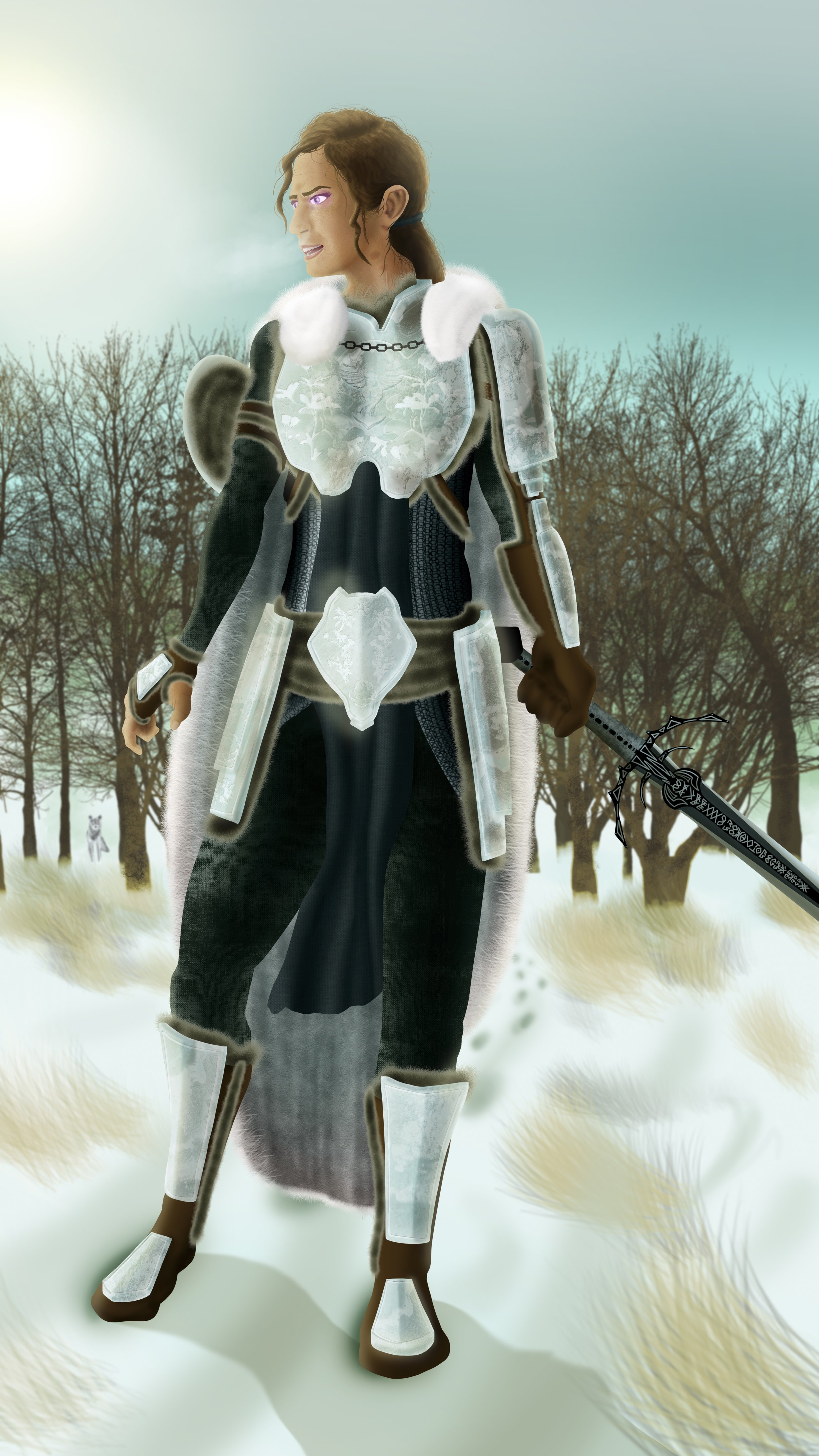
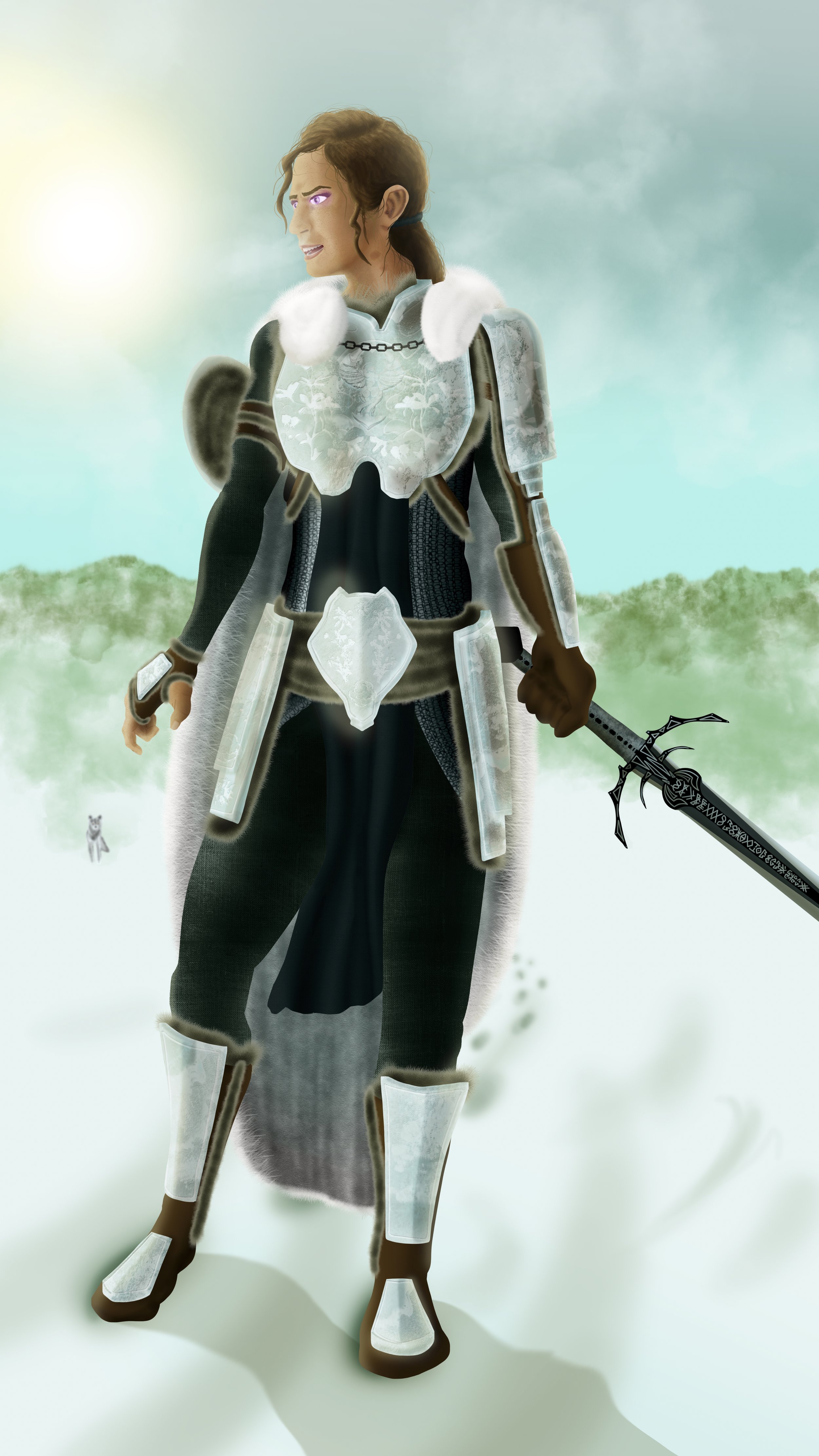
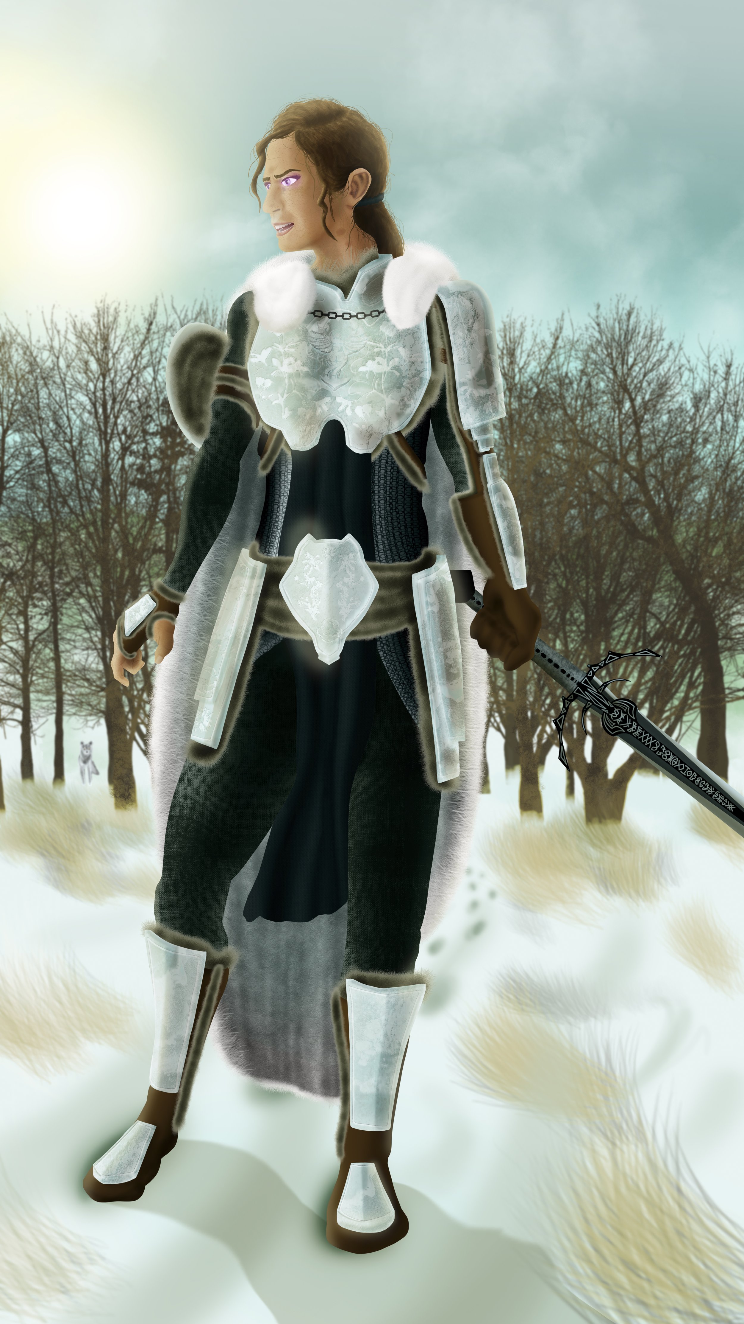
Background
The second half to a full illustration. I want her face to be a main focus. A warrior in the wilderness demands to blend into their surroundings. Lets give gradual values to the background.
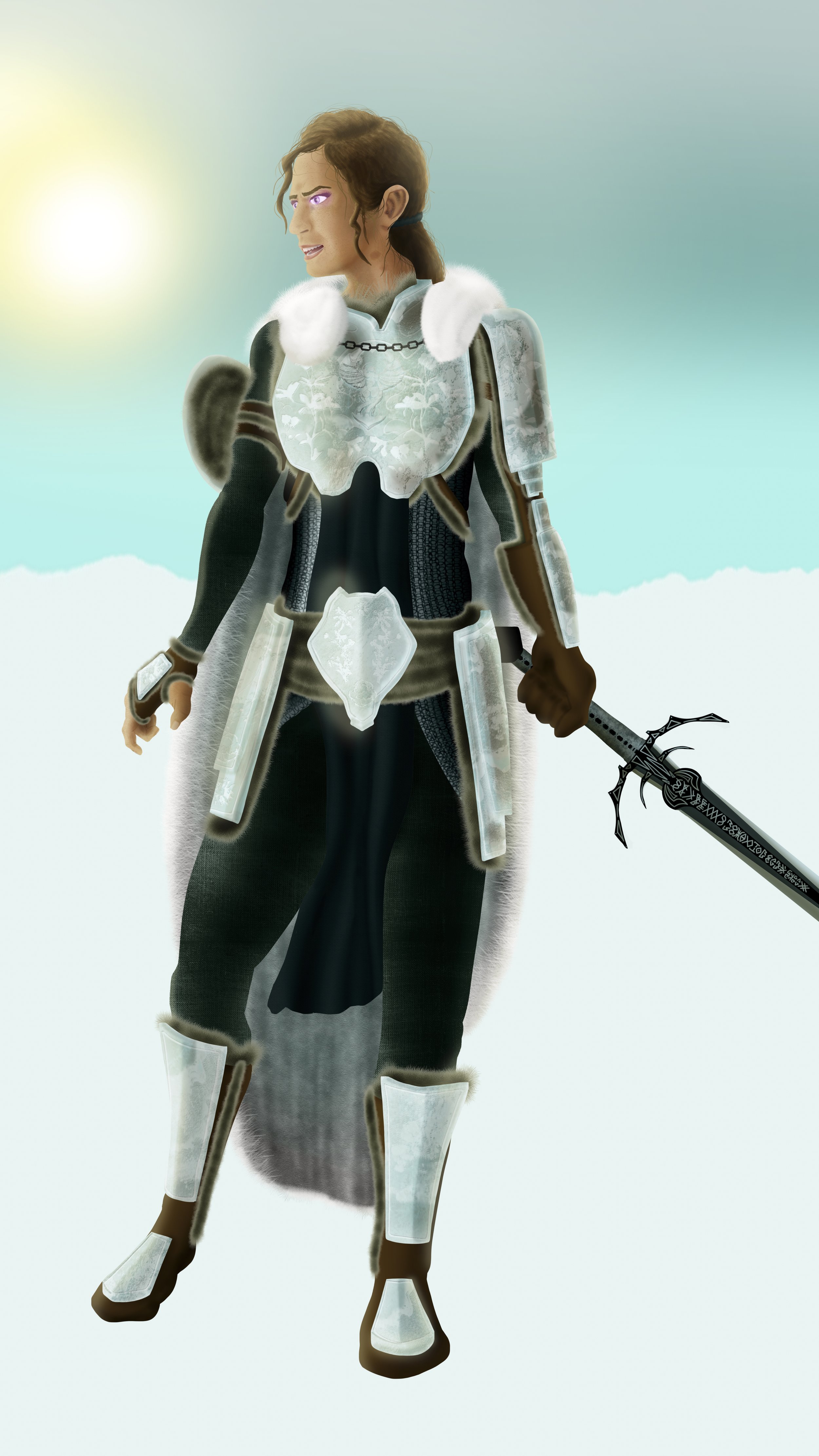
Initial lighting
I place a source of light either onto or off the primary canvas to establish proper lighting angles. This helps me identify the source of light in the world.
Color Lighting
Adding in color to light and soft colored highlights allows the image to become that much more real. Lets set her stage in an open wild to tie her furry textures to more wild elements. With yellow sunlight, I can also take advantage of the soft magenta glow to her eyes, which can add in a small complementary contrast to pull our eyes.
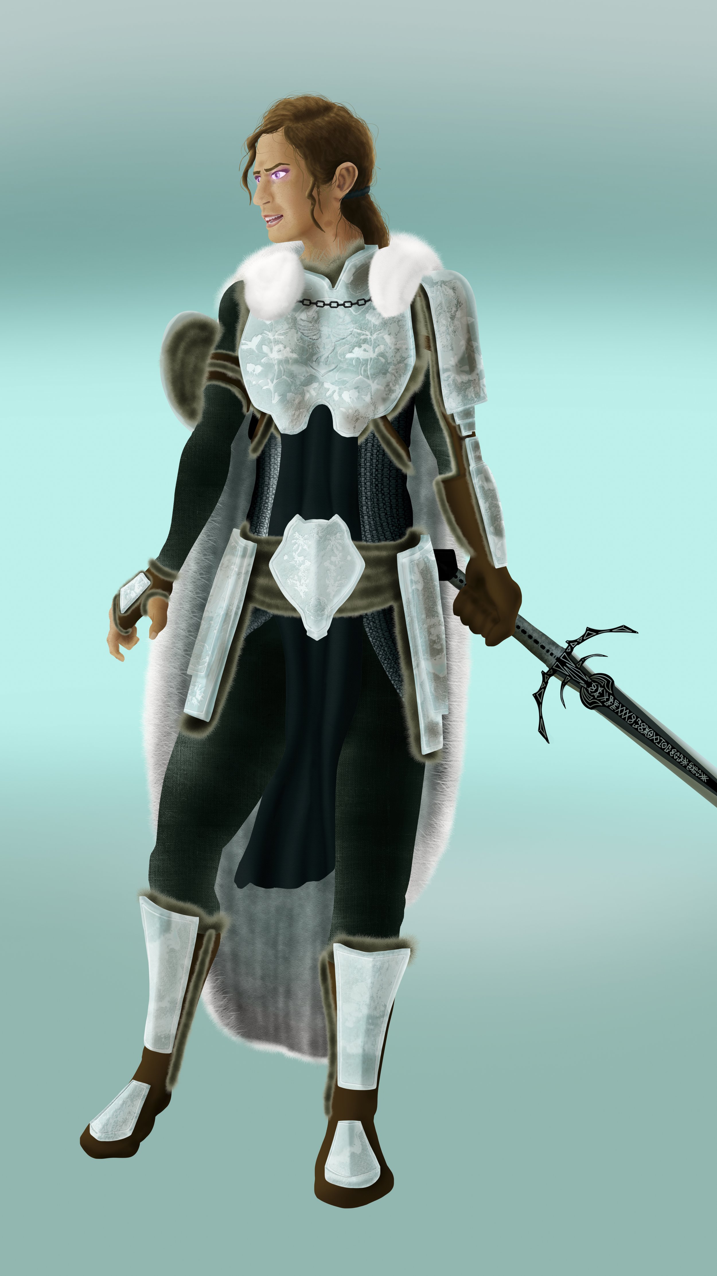
Landscaping
Next I establish geographical and foundational features to the world we place our character. It must be cold if she’s wearing so much fur, so it must be a snow-covered tundra.
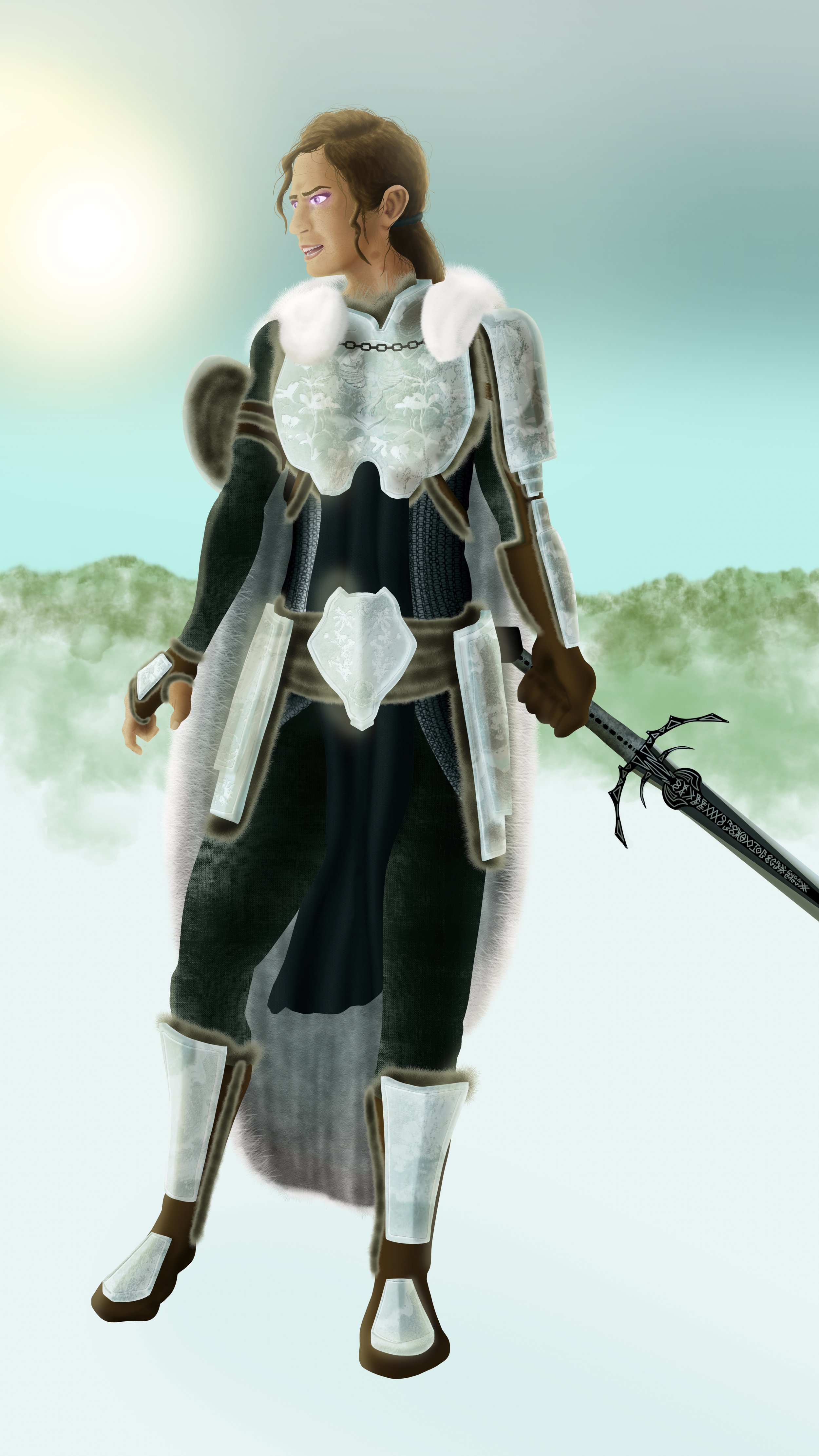
Background Detail
Next I incorporate large and loose shapes to overlay my background, before bluring it out of focus to establish distance. I utilize this stage to add in some other color to tie in split-complimentary elements.
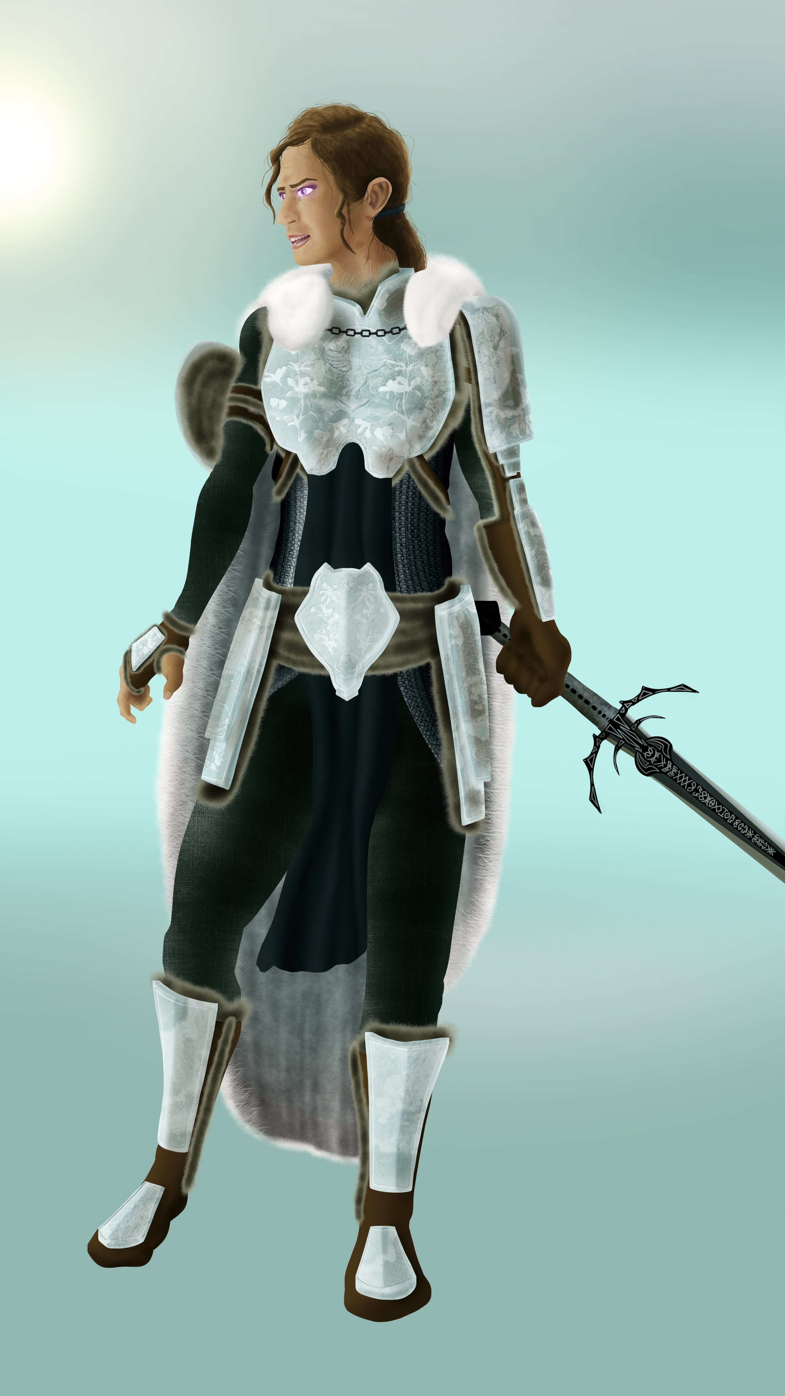
Shadows
Shadows always help establish figure-ground relationships in geometric environments. Now that we have ground and distance, we can lay in some quick out of focus elements. Let’s add one lone wolf to reinforce our running theme. Since we also have established light, we can start placing hard shadows, too.
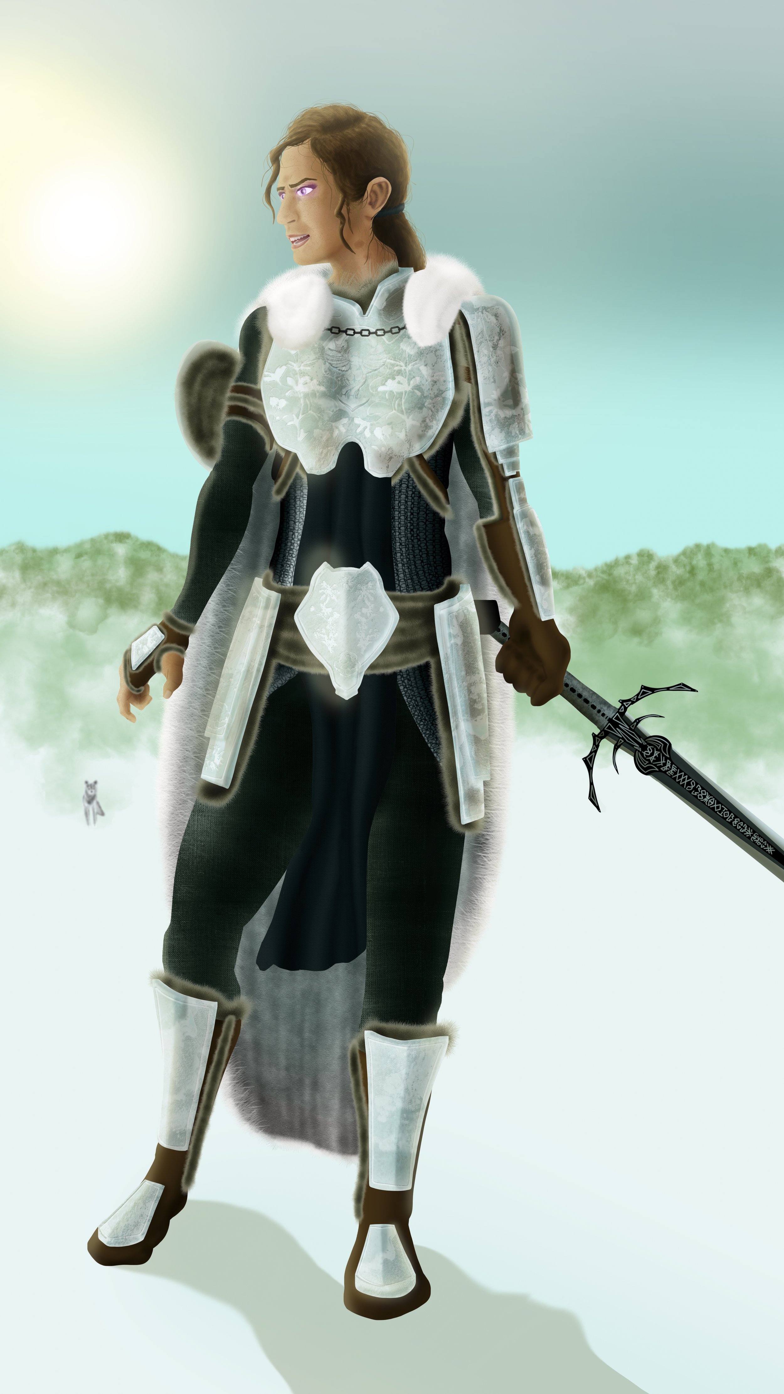
Foreground Detail
I add in foreground detail to help lead the viewer closer in the implied space. Flat ground is seldom interesting. Snow is often lain soft. We can still distort the ground by adding shadows which imply an uneven ground.
Midground features
To break up the distance between proximal distances for a believable range, I like to add in features between, so it doesn’t all look so empty. I opted to lay in dead and dry foliage for a land with little hope for survival.
Weather
It’s always worth considering external weather, even if you can’t readily see it in the open, there are still effects it would have on your world. Even soft and wispy clouds scattered by the winds of the flat lands, they are still there to texture the sky imperfectly.
Putting it all together
The last step, the most important step. Making sure it all fits and works together. We see now that our protagonist Aurora has stopped moving with near-bated breath for the next path of her journey.
Rainald
Kilnscorcher
Fanarts
Skaia
Caliban1
Aurora